The majestic peaks of the Himalaya evoke the absolute stillness of cosmic consciousness and the highest spiritual realm, infusing the brand with ancient trust and divine authority. Emerging from this Shankh base, the radiant flame of the Diya symbolizes the awakening
By blending the eternal stillness of the mountains with the active light and sound of worship, the design resonates with deep holiness and inclusivity making the identity more relatable.


Brand Resources
One stop shop to download logos, photos, fonts, and more. Need anything that's not here? Write to hello@become.team
Downloads
Brand Logo Concept Note:
Sacred Resonance
Logos
1. Primary Logos
Logos! Download them, use them where you use logos. You know the rules, no putting it upside down, stretching it, or doing anything else funky.
%202.svg)
%20copy%201.svg)
%20copy%201.svg)

%20Transparent%20BG%201.svg)
%20Transparent%20BG%20copy%202.svg)
%20Transparent%20BG%202.svg)
%20Transparent%20BG%20copy%201.svg)
Fonts
Let developers and designers download source files in no time.
.svg)
.svg)
Guidelines
Our design system helps us work together to build a great experience for all of your communication touchpoints. Setting a global typography for the brand helps in scalability and consistency.
Typography
Starting the website with global typography is the easiest way to build a scalable website.
1. Poltawski Nowy
Poltawski Nowy grounds the identity in tradition with its refined serif character, subtly evoking India’s rich cultural heritage while retaining modern legibility. It strikes a balance between heritage, elegance, and clarity which works perfectly for the headline text.
2. Manrope
Manrope complements Poltawski Nowy with its clean, modern character, creating a clear visual contrast without disrupting the overall identity. Its excellent readability makes it well suited for body text and functional communication, bringing balance and clarity to the brand system.
Size Guideline
Become provides a constrained set of typographic styles. These styles map as much as possible to functional roles so you know when each can be used. Don’t use units for line-heights. Keep it unitless
Heading
.svg)
H1 / 64PX / 1.3 EM
H2 / 48PX / 1.3 EM
H3 / 38PX / 1.3 EM
H4 / 30PX / 1.3 EM
Paragraphs
Here is a dummy text for your next sub-headline. Subheading Text Styles in this font and this size make everything more legible.
We are not ‘an alternative to the status quo’, we are ‘the alternative to the status quo.
Big Paragraph/ 30PX / 1.8 EM
We are not ‘an alternative to the status quo’, we are ‘the alternative to the status quo.
Small Paragraph/ 24PX / 1.5 EM
We are not ‘an alternative to the status quo’, we are ‘the alternative to the status quo.
Small Paragraph/ 18PX / 1.15 EM
Application
.svg)
Color
There's nothing better than using a global color scheme across the brand. The color scheme leverage brand recognition and marks our vibrant presence.
Primary Colors
Our primary color palette consists of three values, creating a sense of cohesiveness in every collateral. Sporty Orange and Amber Red are essential the colors in the monogram while Paprika is used in the typeface to create a synergy between them further reestablishing the sense of balance.
Bharat Saffron
HEX: #FF6820
RGB: 255, 104, 32
Pantone: 165 C
RGB: 255, 104, 32
Pantone: 165 C
Amber Red
HEX: #D23105
RGB: 210, 49, 5
Pantone : 1665 C
RGB: 210, 49, 5
Pantone : 1665 C
Paprika
HEX: #BC300A
RGB: 188, 48, 10
Pantone : 1525 C
RGB: 188, 48, 10
Pantone : 1525 C
Secondary Colors
The secondary palette consists of two fundemental colours (Gin Fizz and Health) which works as a contrasting background colour in both light and the dark version of the logo respectively, Vermillion can be used as alternative of Amber Red in case of darker background/subject.
Marble white
HEX: #FFFBE2
RGB: 255, 251, 226
Closest Pantone: 705 C
RGB: 255, 251, 226
Closest Pantone: 705 C
Vermillion
HEX: #E94534
RGB: 233, 69, 52
Pantone: 179 C
RGB: 233, 69, 52
Pantone: 179 C
Mahogany brown
HEX: #521013
RGB: 82, 16, 19
Pantone: 4975 C
RGB: 82, 16, 19
Pantone: 4975 C
Logo Usage
There's nothing better than using a global color scheme across the brand. The color scheme leverage brand recognition and marks our vibrant presence.
Exclusion Zone
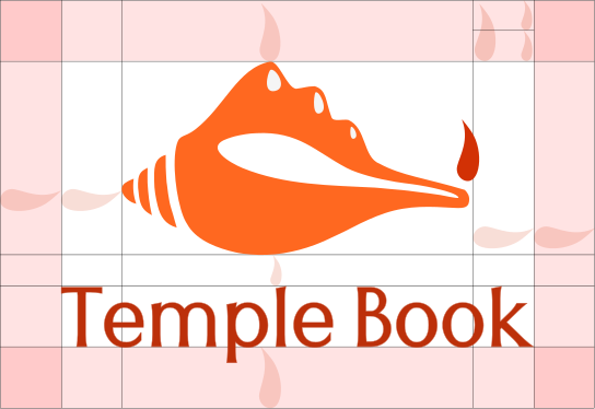
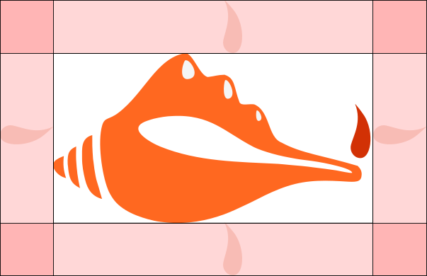
When placing the formal logo, be sure that other text and graphic elements do not encroach on it. When visual elements are placed too close to the logo, it can lead to a congested unpleasant appeal and also might create confusion. In order to let the logo breathe, it should be surrounded with clear space to ensure its visibility and impact.
For the Primary Logo, The marigin for the typeface is equal to the ‘Diya Flame’ on all sides. The space between the monogram and the text is equal to that of half the size of the ‘Diya Flame’.
For the Primary Logo, The marigin for the typeface is equal to the ‘Diya Flame’ on all sides. The space between the monogram and the text is equal to that of half the size of the ‘Diya Flame’.
Proper Application of Logo: DOs
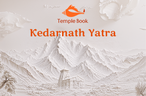
Always use the Temple Book logo with Imagery which creates a good contrast while also maintaining the legibility
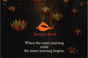
While using the Temple book with dark imagery/palette make sure it stands out from the background.Do not rotate the logo.
.jpg)
Always use the correct logo+background pairing to maintain the contrast level.Do not alter the form of the logo.
.svg)
Always maintain a minimum area of the exclusion zone around the logo to maintain design hygiene and legibility.
Logo Misuse: DON’Ts
Some of the examples of most likely misuses of identity are shown below. It’s imperative that the brand identity is consistent across all touchpoints at all times. To avoid these, always use the provided identity from here without any modification.
.png)
Do not use the logo with similar value/ very busy background.

Do not stretch, squeeze, rotate or distort any part of the logo.Always scale uniformly.Do not rotate the logo.

Do not change the typeface within the wordmark.Do not alter the form of the logo.
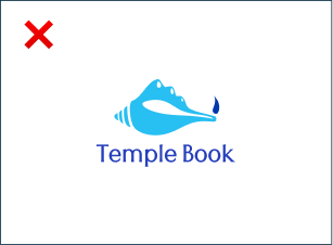
Do not change the colors of the logo randomly
.png)
Do not add any effects to the logo.
Text Usage: DOs
.svg)
Always follow the right pairing of fonts and sizes, to be mindful of legibility
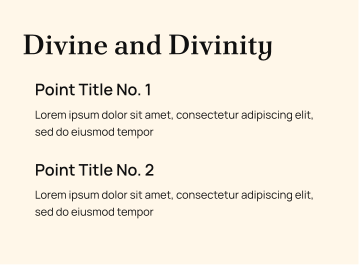
Use only light coloured backgrounds for applications that are text heavy
Text Usage: DON’Ts
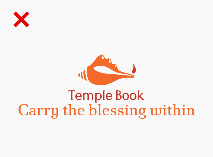
Do not overlap text with the exclusion zone of logo. Do not use darker backgrounds with text heavy applications.
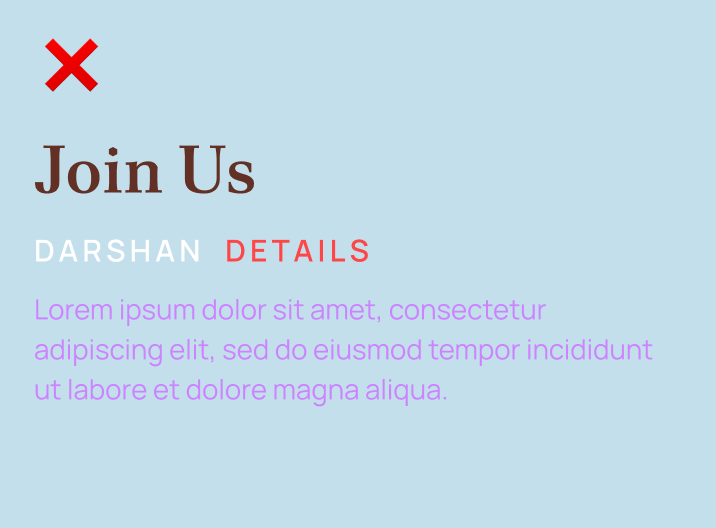
Prioritize colour contrast of the text based on the importance it has on the application. Do not use too many text colours on the same application.