Inspired by Origami as a philosophy of transformation, the SGI monogram turns a simple geometric form into an elephant, symbolising courage, strength, wisdom and potential.
Every great company begins with something deceptively simple: an idea. Like a single sheet of paper, an idea holds limitless potential, but requires the courage to be shaped.
Each fold represents an intentional decision: changing the form, creating new possibilities and moving closer to the final outcome. In the same way, SGI Collective transforms bold ideas through experimentation, action and iteration, shaping them into ventures built for growth and impact.


Brand Resources
One stop shop to download logos, photos, fonts, and more. Need anything that's not here? Write to hello@become.team
Brand Logo Concept Note:
Origami - a philosophy of transformation
Logos
Primary Logos
Logos! Download them, use them where you use logos. You know the rules, no putting it upside down, stretching it, or doing anything else funky.
.svg)
.svg)
.svg)
.svg)
.svg)
.svg)
.svg)
.svg)
Primary Monogram
.svg)
.svg)
.svg)
.svg)
.svg)
.svg)
.svg)
.svg)
.svg)

Typography
Our design system helps us work together to build a great experience for all of your communication touchpoints. Setting a global typography for the brand helps in scalability and consistency.
Brand Fonts
1. Satoshi
Satoshi font is a Swiss style modernist sans serif type family characterized by the play between elegant rounded shapes and sharp angular details. The family has five weights on offer, ranging from Light to Black. Satoshi’s lowercase ‘a’ and ‘g’ are double-storied; however, single-storied alternates are available, through an OpenType feature. There are tabular lining figures, as well as numerators and denominators for typesetting fractions. The fonts’ lining figures have the same height as the uppercase letters. The lowercase’s ascenders are drawn to be slightly taller than the common height of the capital letters and numerals
2. Public Sans
Public Sans combines strength and neutrality for interfaces, text, and headings, designed by USWDS, Dan Williams, Pablo Impallari, and Rodrigo Fuenzalida, is a neo-grotesque typeface introduced this era. Based on Libre Franklin,. Public Sans boasts flexible script support, accommodating Latin, Latin-extended, and Vietnamese scripts. This versatile typeface became a variable font and works best as body font
Size Guideline
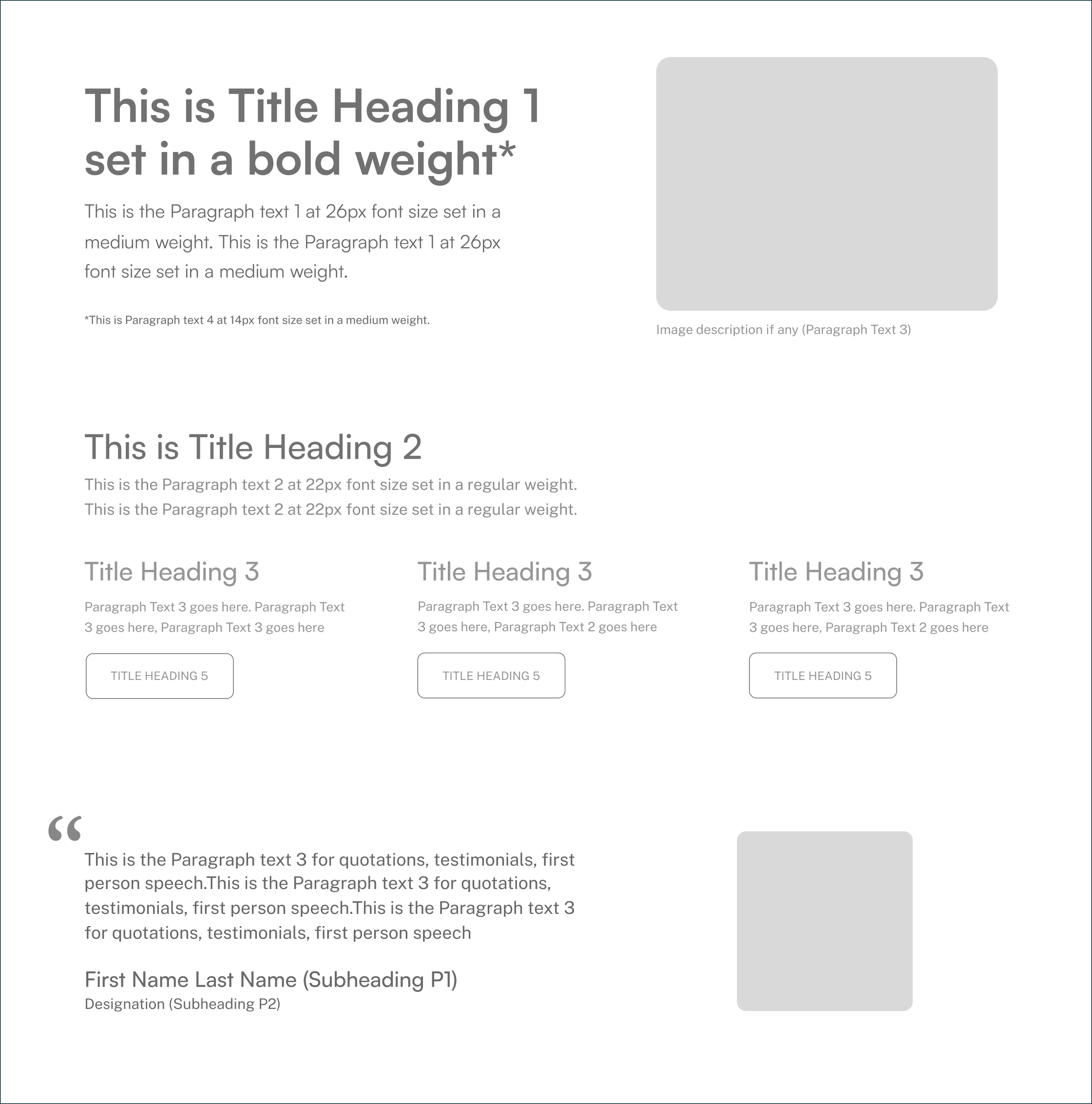
Become provides a constrained set of typographic styles. These styles map as much as possible to functional roles so you know when each can be used. Don’t use units for line-heights. Keep it unitless
Title Heading Styles

H1 / 64PX / 1.3 EM

H2 / 48PX / 1.3 EM

H3 / 38PX / 1.3 EM

H4 / 30PX / 1.3 EM
Subheading and Paragraph Text Styles

P1/ 30PX / 1.8 EM

P2/ 24PX / 1.8 EM

P3/ 18PX / 1.8 EM

P4/ 16PX / 1.8 EM
Application
Color
There's nothing better than using a global color scheme across the brand. The color scheme leverage brand recognition and marks our vibrant presence.
Primary Colors
Our primary color palette consists of main primary along with it’s tint and tone variation. Black is the brand’s iconic primary colour factoring 50% in terms of application with it’s colour variations. Usage the tint and tone should be done sparingly as the environment and when required to stand out in comparison to the parent colors.
Black
HEX: #000000
RGB: 0, 0, 0
Pantone : Black 6 C(dist. 43)
RGB: 0, 0, 0
Pantone : Black 6 C(dist. 43)
White
HEX: #FFFFFF
RGB: 255, 255, 255
Pantone : 7436 C(dist. 46)
RGB: 255, 255, 255
Pantone : 7436 C(dist. 46)
Secondary Colors
The secondary palette consists of three foundational colours representing dark, light and a tone variant of colour that accommodates and goes along with the primary colours as the extension colours
Bold Black
HEX: #222222
RGB: 34, 34, 34
Pantone : Neutral Black C(dist. 1)
RGB: 34, 34, 34
Pantone : Neutral Black C(dist. 1)
Venture Green
HEX: #005011
RGB: 0, 80, 17
Pantone : 3308 C(dist. 40)
RGB: 0, 80, 17
Pantone : 3308 C(dist. 40)
Warm White
HEX: #FBFCF0
RGB: 251, 252, 240
Pantone : 663 C (dist. 36)
RGB: 251, 252, 240
Pantone : 663 C (dist. 36)
Accent Colour
We have a single accent colour to keep things fresh and interesting. We lean on these colour more frequently when brand awareness is high, or in own properties where we control the surrounding environment.
Growth Spark
HEX: #FFD000
RGB: 255, 209, 102
Pantone : 134 C(dist. 8)
RGB: 255, 209, 102
Pantone : 134 C(dist. 8)
Logo Usage
There's nothing better than using a global color scheme across the brand. The color scheme leverage brand recognition and marks our vibrant presence.
Exclusion Zone
When placing the formal logo, be sure that other text and graphic elements do not encroach on it. When visual elements are placed too close to the logo, it can lead to a congested unpleasant appeal and also might create confusion. In order to let the logo breathe, it should be surrounded with clear space to ensure its visibility and impact.
The tusk length halved is used for letters in wordmark should be respected as the minimum distance and full tusk length from all sides of the logo as well as single rhombus shape from head as height in the monograms, to any other objects or margins in the composition.
The tusk length halved is used for letters in wordmark should be respected as the minimum distance and full tusk length from all sides of the logo as well as single rhombus shape from head as height in the monograms, to any other objects or margins in the composition.
.avif)
Proper Application of Logo: DOs
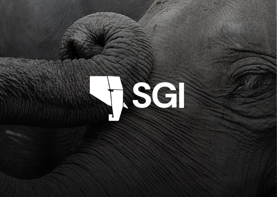
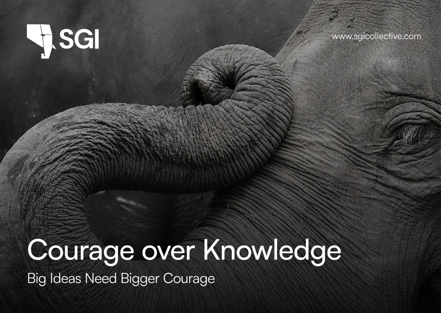
Always use the SGI light logo on dark Imagery/ darker parts of the Imagery to maintain the contrast level
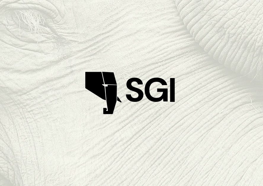
Always use the SGI Dark logo on light imagery/ lighter parts of the Imagery to maintain the contrast level
Always use the correct logo+background pairing to maintain the contrast level.
Always maintain a minimum area of the exclusion zone around the logo to maintain design hygiene and legibility.
Logo Misuse: DON’Ts
Some of the examples of most likely misuses of identity are shown below. It’s imperative that the brand identity is consistent across all touchpoints at all times. To avoid these, always use the provided identity from here without any modification.
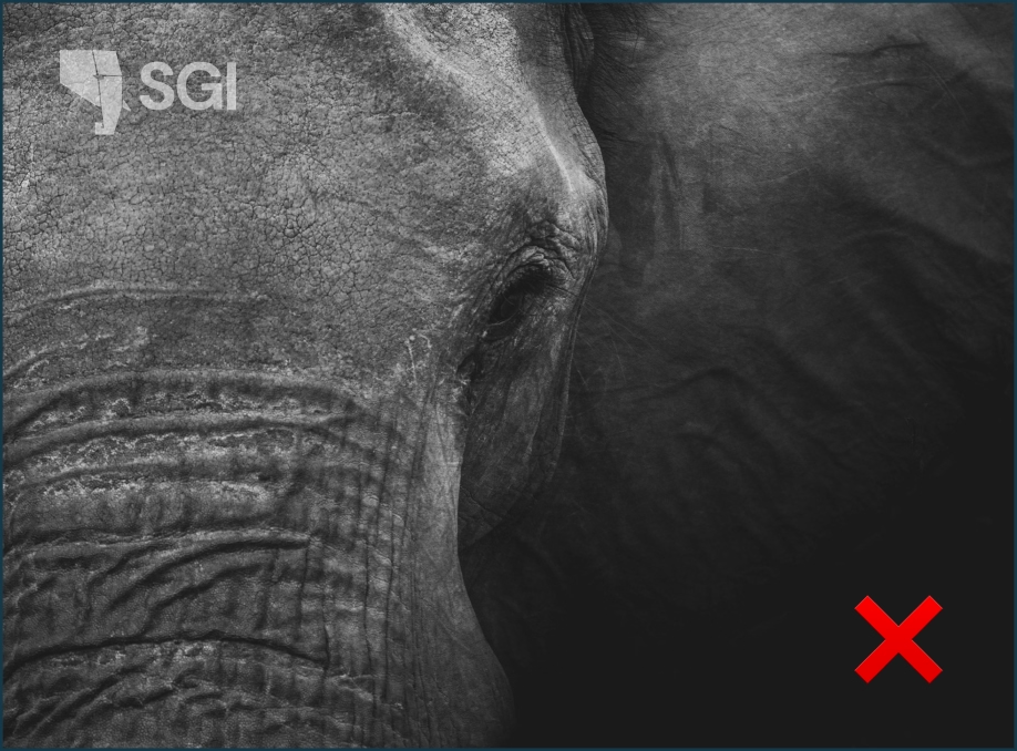
Do not keep a low contrast between the image and thecolor of the logo.

Do not stretch, squeeze, rotate or distort any part of the logo.Always scale uniformly.

Do not change the typeface within the wordmark.
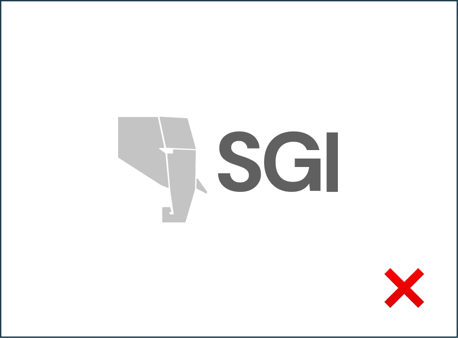
Do not change the colors of the logo randomly
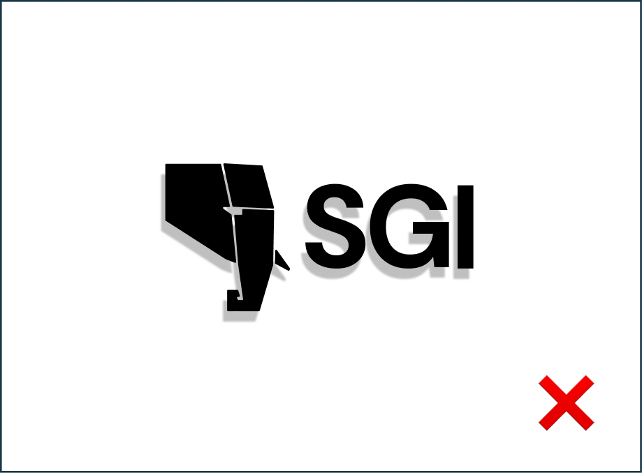
Do not add any effects to the logo.
Text Usage: DOs
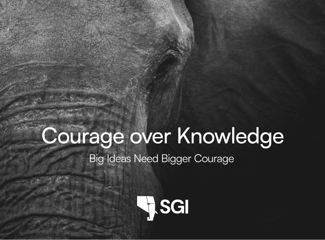
Always follow the right pairing of fonts and sizes, to be mindful of legibility
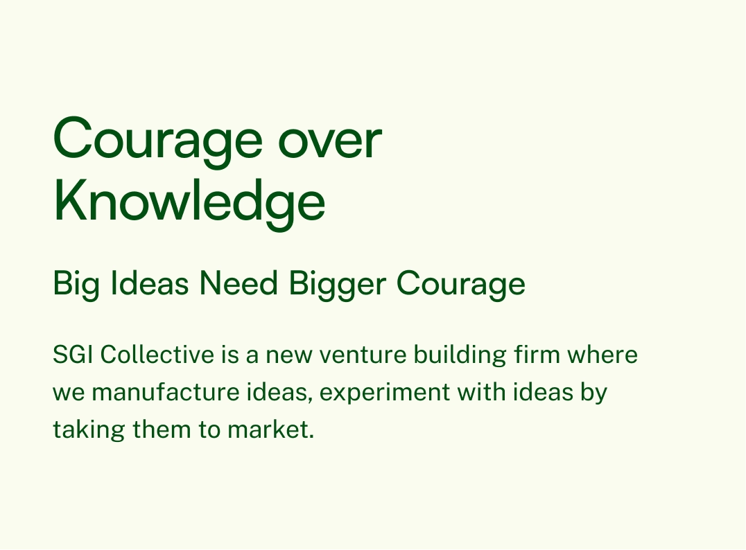
Use only light coloured backgrounds for applications that are text heavy
Text Usage: DON’Ts
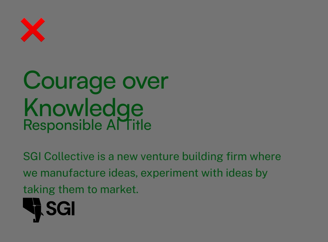
Do not overlap text with the exclusion zone of logo. Do not use darker backgrounds with text heavy applications.
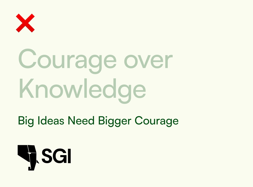
Prioritize colour contrast of the text based on the importance it has on the application. Do not use too many text colours on the same application.